Lillington, NC Flood Discharge
Terrain Modeling

Terrain Modeling

Lillington is a small town in North Carolina with a population of less than 5000 people.
It is located in the heart of NC along the Cape Fear River. Because of the town's close proximity to a major river,
heavy rainfall events such as hurricanes cause water levels to rise to dangerous levels and threaten critical infrastructure.
In the interest of protecting municipal infrastructure and private property, predicting stream runoff during a heavy rainfall could prove invaluable.
One such method of flood prediction is to model a unit hydrograph using elevation data.
A unit hydrograph is a line chart that models water runoff due to excess precipitation over time.
The methods and procedures needed to build the unit hydrograph model can be described in five parts. Precondition an elevation model, delineate a watershed, create a velocity field, create an isochrone map, and finally, plot the unit hydrograph.
The workflow for each of these methods will require the application of several GIS tools. In order to precondition the Digital Elevation Model, or DEM, I had to first acquire elevation data. The data source used in this model comes from an exported DEM from Google Earth Engine. Next, I needed to identify and fill any sinks in the model in order to remove small imperfections and to create a smother model of water flow. This part of the process also requires collecting an outlet point and establishing a study boundary. For this model I have selected to use the local water treatment facility located adjacent to the Cape Fear River and limited the analysis to the local county boundary line.
When the DEM is ready for analysis, the elevation model needs delineation to determine the watershed area which, is the area that water will eventually flow to the outlet point. To do this the flow direction of the study area is calculated. Once a direction has been determined for each pixel in the study area, the flow accumulation tool is used to create a raster layer field that expresses where water is likely to accumulate. After flow accumulation field is calculated, the watershed tool can calculate the effective watershed for the outlet point.
At this point, a velocity field needs to be created. This field will determine how fast water flows over a given surface and is calculated by the following formula:
V = Vm * (sbAc) / (sbAcm);
Where V is the velocity of a single cell with a local slope of s and an upstream contributing area of A. Coefficients b and c can be determined by calibration, a statistical method of tweaking model parameters so that predicted data is as close as possible to observed data.
To create this velocity field I calculated the slope over the study area using the Slope tool and then used the resulting slope later to derive calculate the slope area term used in the above formula by taking the square root of the slope later and multiplying by the square root of the flow accumulation field.
After calculating the velocity field, I created an isochrone map that predicts how fast water will flow through the velocity field and into the outlet point. This map will yield how much time is needed for water to get from any point on the map and into the outlet point. To calculate flow-time I used the following formulas:
Flow time [T] = Flow Length [L] / Velocity [LT-1]
Flow time [T] = Flow Length [L] * Weight [L-1T]
Using the system of equations above to solve for weight, the following formula is the result.
Weight [L-1T] = 1 / Velocity [LT-1]
A weight grid layer was calculated using the map algebra tool to calculate the inverse of the velocity layer. The next tool used in creating an isochrone map is the Flow Length tool. Once this tool is ran, it yields a raster layer that has a continuous set of values that represent time that then need to be reclassified into discrete units. For this model I have chosen to classify flow time by the minute.
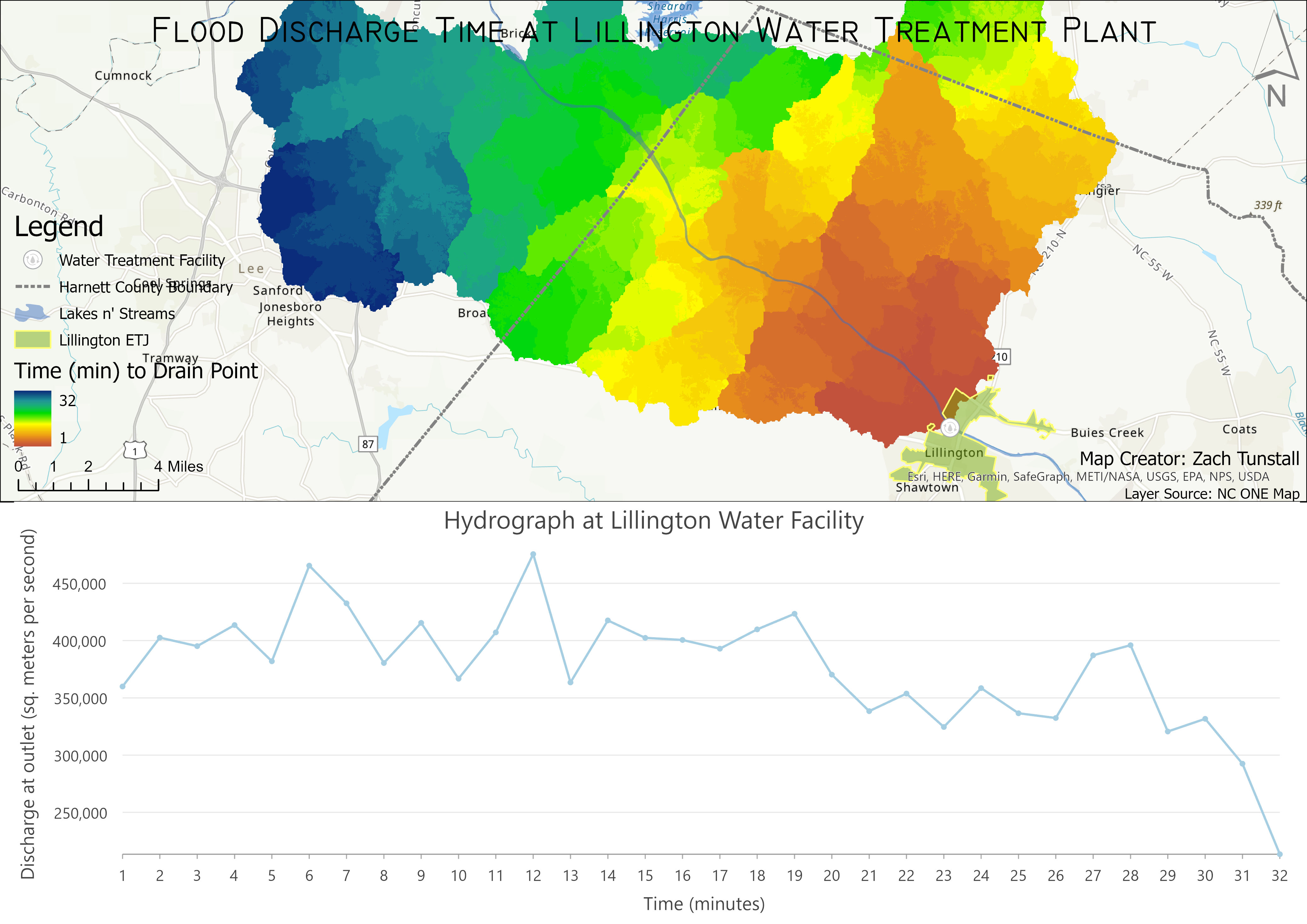
The final procedure in this project is to create a unit hydrograph table. The isochrone map is converted into a table which hosts a count of pixels for every minute of flow time. The resulting map shows this isochrone layer and how each color represents each area that is approximately the same amount of time required to reach the outlet point. The pixel count from the isochrone table was converted to area which is used in the following equation that calculates the unit hydrograph. The unity hydrograph was then plotted to a chart using a line graph.
Ui = U(i∆t) = (A(i∆t) - A[(i - 1)∆t]) / ∆t;
Where A(t) is the cumulative drainage area that drains to the outlet within time t since rainfall began
This equation can be written simply as:
Ui = Ai / ∆t
Where Ai is the incremental drainage area of the ith isochrone zone.
The following chart is the result of the equations above applied to the isochrone table created for this model. From This chart we see that a maximum flood surge will occur at the 120 minutes after a major rainfall event. There is also a surge in water discharge after 60 minutes. This hydrograph shows that the flooding will subside after 320 minutes after a major rainfall event has concluded.
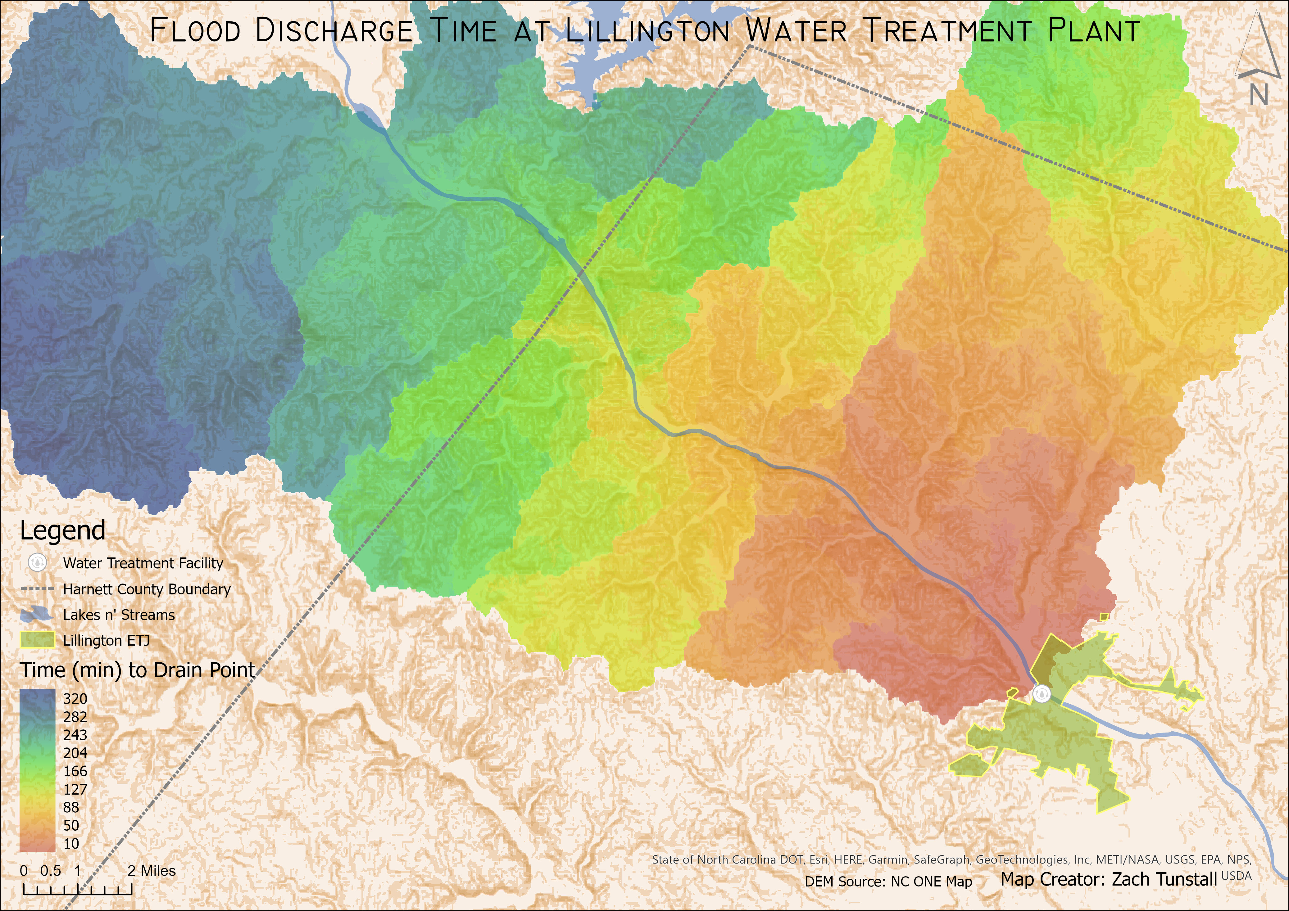
The isochrone map below categorizes each 10-minute interval by plotting different colors in the area that covers the watershed for the water treatment facility.
Note that the base map layer is derived from the slope of the digital elevation model.
This is to display how the different landforms in the study area affect the rate at which water will flow to the outlet point of the water basin.
Also included in the map is the Lillington city limits, the Harnett County boundary line and the water treatment facility location noted with the white marker.
This gives context to the scale and location of the map and shows that water basins and other natural landforms do not always coincide with manmade boarders.

The overall purpose of this project was to develop skills in hydrologic modeling using data from non-governmental organizations. With the continued expansion of free and open-source remote sensing data from platforms such as Google Earth Engine, I find it important to learn how to better use these platforms to perform data analysis. While there are many datasets from sources such as the US Geological Survey, sometimes the needs of a project require unique data that is not within the coverage area of some of these sources. The first step is the most critical and can be the most difficult to perfect. Finding a source of a DEM that has not been resampled in any way ensures that the results are accurate. Working through this model several times and trying to get a DEM that works at a spatial resolution of less than 30m2 will not yield results that are representative of real-world phenomena (at least at the time of this writeup). Also, using a resampled DEM source will cause the isochrone map to have a more generalized output that is also not necessarily representative of the real world. This leads to a unit hydrograph that does not have a bell curve shape. I believe that this project, like any other can benefit from reanalyzing the data using a variety of different sources. As remote sensing platforms improve their spatial resolution, more accurate models will yield results that better describe real world phenomenon.
Spatial Statistics and Open Source Modeling Maps
